Interface
User Interface
Before talking about all the modules that abstract learning concepts in Nifty we need to first familiarize ourselves with the visual components that are used to help you interact with all the data.
Nifty uses four main UI elements that allow you to perform various actions throughout the app.
Dashboards
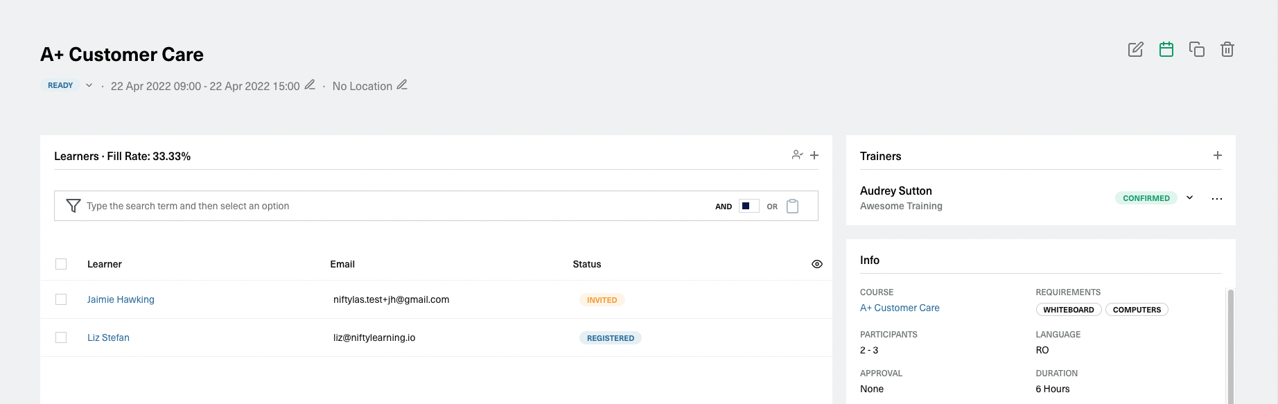
Dashboards are mainly used in View Pages where information needs to separated into different contexts. With this form of organisation it's easy to get a general overview of a resource while also being able to fine tune smaller, more specific details.
Take for example the Live Session View Page, a place where you can find details about the learners, trainers, costs or surveys that are used in that session. Each section is grouped in different Cards, that encompass many other UI elements. From each card you can perform custom actions or view and analyze data.
Data Tables
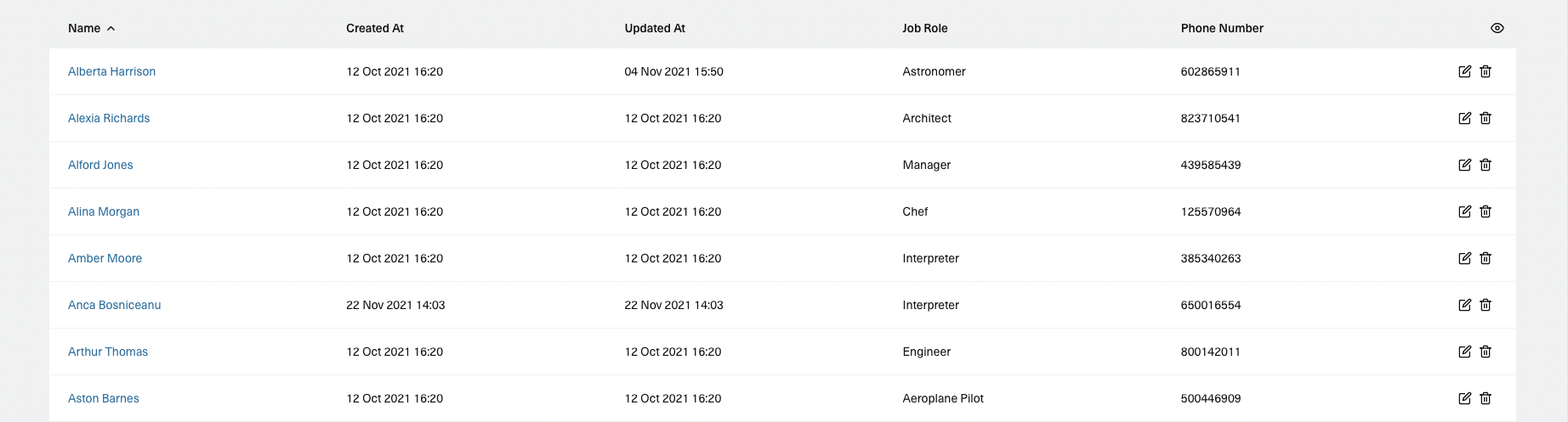
When it comes to working with large amounts of data it's pretty hard to beat a good old table. With that in mind Nifty uses a component that enhances the simple concept of a table and enables to you to perform various actions on large amounts of data.
Sorting
To sort your data by a specific column you just need to click on that column and the ordering will be changed. The data will now be sorted ascending. To sort it descending you need to click again on that column. If you want to reset the sorting you just need to click on the column that's sorted descending.
Pagination
Most of the tables use a configuration of 20 rows per page. So if your dataset is bigger than that the information will be paginated. The pagination menu will be visible at the bottom of your table. From there you can navigate to other pages and, for most of the tables, you can also edit the number of rows shown in a page.
Row Selection
Around the app you can perform batch actions on multiple rows. Rows can be selected using the checkboxes or, in some cases, the radio buttons that appear at the beginning of each row. After a row is selected a new actions menu will appear at the bottom of the table. In here you will first find information about the number of rows that are selected and then all the actions that can be performed on those rows.
To select all the visible rows you need to click on the checkbox that sits at the start of the table header. This will automatically check all the row checkboxes and then will show you the table selection menu. If the table has multiple pages and you want to select the entire dataset you will have to click on the Select All Rows action from the menu.
Row Actions
Most of the tables will also allow you to perform single row actions from the button actions that are visible at the end of each row. The icons are pretty straightforward (trash can for delete, pen on paper for edit) but if you hover on each action you will also see a more descriptive name for what you are about to perform.
View/Hide Columns
At the end of the table header you will find an eye icon. By clicking it you will open a list with all the columns and their visibility status. From there you can toggle the column visibility.
Search and Filtering
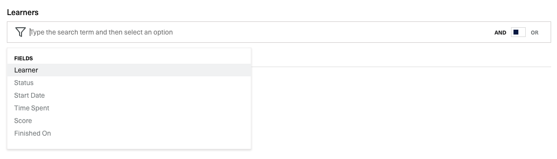
All the tables come with a filter bar. Most of the table columns will be accessible in the filter bar as fields that can be used for filtering.
Modals and Side Modals
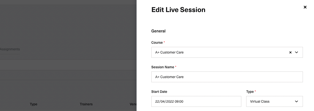
Modals and Side Modals are used to provide you with a focused context when performing certain actions: creating and editing resource, performing complex actions or confirming various flows.
Filter Bar
The querying powerhouse behind all listing views is the Filter Bar. It uses simple flows to allow you to perform different types of queries over all the learning data.